
Technical Analysis
Introduction
A method of evaluating securities by relying on the assumption that market data, such as charts of price, volume, and open interest, can help predict future (usually short-term) market trends. Unlike fundamental analysis, the intrinsic value of the security is not considered. Technical analysts believe that they can accurately predict the future price of a commodity by looking at its historical prices and other trading variables. Technical analysis assumes that market psychology influences trading in a way that enables predicting when a commodity will rise or fall. For that reason, many technical analysts are also market timers, who believe that technical analysis can be applied just as easily to the market as a whole, as it is done to an individual commodity.
Technical Analysis is the forecasting of future financial price movements based on an examination of the past price movements. Like weather forecasting, technical analysis does not result in absolute predictions about the future. Instead, technical analysis can help investors anticipate what is "likely" to happen to prices over time. Technical analysis uses a wide variety of charts that show price over time.
The Basis of Technical Analysis
At the turn of the century, the Dow Theory laid the foundations for what was later to become modern technical analysis. Dow Theory was not presented as one complete amalgamation, but rather pieced together from the writings of Charles Dow over several years. Of the many theorems put forth by Dow, three stand out:
- Price Discounts Everything
- Price Movements Are Not Totally Random
- What Is More Important than Why
Now let’s look at each one by one.
- Price Discounts Everything
This theorem is similar to the strong and semi-strong forms of market efficiency. Technical analysts believe that the current price fully reflects all information. Because all information is already reflected in the price, it represents the fair value, and should form the basis for analysis. After all, the market price reflects the sum knowledge of all participants, including traders, investors, portfolio managers, buy-side analysts, sell-side analysts, market strategist, technical analysts, fundamental analysts and many others. It would be folly to disagree with the price set by such an impressive array of people with impeccable credentials. Technical analysis utilizes the information captured by the price to interpret what the market is saying with the purpose of forming a view on the future.
- Prices Movements are not Totally Random
Most technicians agree that prices trend. However, most technicians also acknowledge that there are periods when prices do not trend. If prices were always random, it would be extremely difficult to make money using technical analysis. A technician believes that it is possible to identify a trend, invest or trade based on the trend and make money as the trend unfolds. Because technical analysis can be applied to many different time frames, it is possible to spot both short-term and long-term trends.
- "What" is More Important than "Why"
In his book, The Psychology of Technical Analysis, Tony Plummer paraphrases Oscar Wilde by stating, "A technical analyst knows the price of everything, but the value of nothing". Technicians, as technical analysts are called, are only concerned with two things:
1. What is the current price?
2. What is the history of the price movement?
The price is the end result of the battle between the forces of supply and demand for the commodity. The objective of analysis is to forecast the direction of the future price. By focusing on price and only price, technical analysis represents a direct approach. Fundamentalists are concerned with why the price is what it is. For technicians, the why portion of the equation is too broad and many times the fundamental reasons given are highly suspect. Technicians believe it is best to concentrate on what and never mind why. Why did the price go up? It is simple, more buyers (demand) than sellers (supply). After all, the value of any asset is only what someone is willing to pay for it. Who needs to know why?
Support & Resistance:
Support and Resistance represents key levels where demand and supply meet. Prices are driven by excessive demand and supply. Demand is synonymous with bulls & buying. Supply is synonymous with bears & selling. If the levels are broken, the relationship between demand and supply has changed.
Support:
Price levels at which the demand is strong enough to prevent it from declining further are called Support Levels. It normally lies below the current price. As price declines towards support, buyers become more inclined to buy and sellers become less inclined to sell. When price reaches support level, demand will overcome supply, preventing prices from further decline.
Resistance:
Price levels at which selling is strong enough to prevent the prices from rising further are called Resistance Levels. It normally lies above the current price. As price rises towards resistance, sellers become more inclined to sell and buyers become less inclined to buy. When price reaches resistance level, supply will overcome demand, preventing prices from further rise.
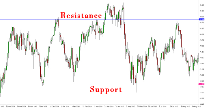
The above chart explains the support and resistance levels. The example is taken for crude oil prices. The support and the resistance levels are taken at USD 69.03 and USD 83.39 respectively. Prices driven by excessive demand or supply did not break the aforementioned levels. The prices did manage to break the resistance levels initially but the supply side was strong enough to reverse the rising trend later.
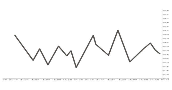
Types of Graphs
The line graph is a line, which connects the closing prices for a given time interval. An example of the line graph is illustrated below:
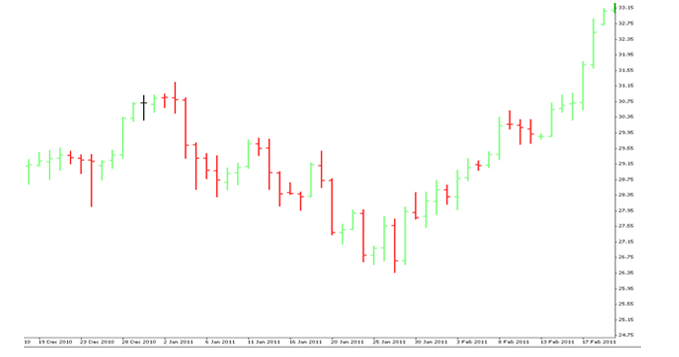
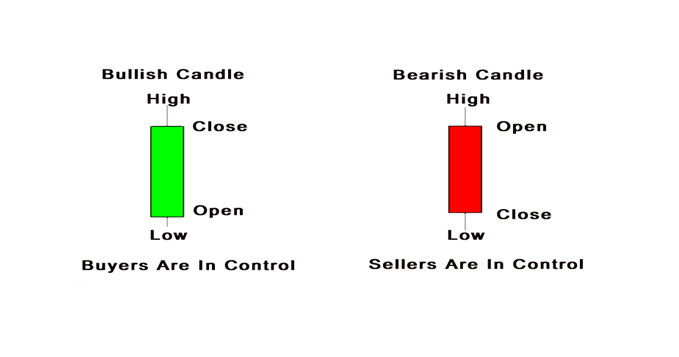
The Bar Chart, also known as the OHLC Chart, uses all the four prices, open, high, low and closing prices for analysis. The prices form a vertical line for a given time period. The line on the left denotes the open price and the line on the right indicates the closing price. If the closing price lies above the opening prices, it indicates a bullish market (green bar below), whereas, if the closing price lies below the closing prices, it indicates a bearish market (red bar below). If the opening prices are at the same level, then it indicates that the bulls and the bears are at equilibrium (black bar below).
An illustration of a Bar Chart is as below:
Candlestick charting first appeared sometime after 1850. Much of the credit for candlestick development and charting goes to a legendary rice trader named Homma from the town of Sakata. It is likely that his original ideas were modified and refined over many years of trading eventually, resulting in the system of candlestick charting that we use today. The Japanese Candlesticks are the most popular charting methods used for technical analysis.
Major Candle Sticks Patterns:
Japanese Candlesticks Patterns are the most popular charting methods to realize a reversal trend. With the occurrence of candlesticks patters, we can recognize the development of a trend which can be helpful in our analysis. However, the candlesticks patterns are effective if used in a pattern of 3 candles. Why? Since the pattern of 3 candles will give the confirmation of a reversal in the trend. However, risk-taking investors might also trade after the formation of the 2nd Candlestick. For risk-averse traders, it is advised to wait for the formation of the 3rd Candlestick for the confirmation of the trade. Market Sentiments also plays a huge role, as traders recognizing the development of the trade will initiate similar trading strategies which will support the future trend of the prices.
Some Major Candlesticks Patterns:
| |
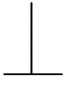
1. Doji: |
|
 |
The Doji is one of the most revealing signals in Candlestick trading. It clearly indicates that the Bulls and the Bears are at equilibrium, a state of indecision. The Japanese say that whenever a Doji appears, always take notice. The Doji signal is comprised of one candle. It is formed when the open and the close occur at the same level or very close to the same level in a specific timeframe. In candlestick charting, this essentially creates a cross formation. As the following illustration demonstrates, the horizontal line represents the open and close occurring at the same level. The vertical line represents the total trading range during that time. |
|
| |
|
|
| |
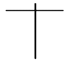
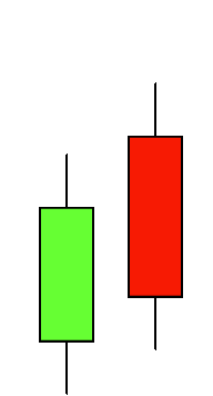
2. Gravestone Doji: |
|
 |
The Gravestone Doji is formed when the open and the close occur at the low of the day. It is found occasionally at market bottoms, but its forte is calling market tops. The name, Gravestone Doji, is derived by the formation of the signal looking like a gravestone.
|
|
| |
|
|
| |
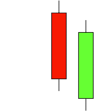
3. Dragonfly Doji |
|
 |
The Dragonfly Doji is formed when the open and the close occur at the top of the day. It is found occasionally at market top, but its forte is calling market bottom. The name, Dragonfly Doji, is derived by the formation of the signal looking like a dragonfly about to take off.
|
|
| |
|
|
| |
4. Bullish Engulfing Pattern |
|
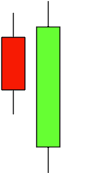 |
The Bullish Engulfing Pattern is formed at the end of a downtrend. A bullish candle is formed that opens lower and closes higher than the bearish candle open and close from the previous day. This complete engulfing of the previous day's body represents overwhelming buying pressure, which dissipates the selling pressure.
|
|
| |
|
|
| |
5. Bearish Engulfing Pattern |
|
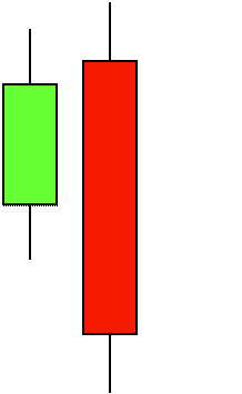 |
The Bearish Engulfing Pattern is directly opposite to the bullish pattern. It is created at the end of an up-trending market. The bearish candle completely engulfs the previous day's bullish candle. This shows that the bears are now overwhelming the bulls.
|
|
| |
|
|
| |
6. Dark Cloud Cover |
|
 |
The Dark Cloud Cover is a two-day bearish pattern found at the end of an upturn or at the top of a congested trading area. The first day of the pattern is a strong bullish candle. The second day's price opens higher than any of the previous day's trading range. The formation of the bearish candle confirms the reversal of the bullish trend.
|
|
| |
|
|
| |
7. Piercing Pattern |
|
 |
The Piercing Pattern is a bottom reversal. It is a two candle pattern at the end of a declining market. The first day confirms the formation of a bearish candle. The second day is a bullish candle. The bullish candle opens sharply lower, under the trading range of the previous day. The price comes up to where it closes above the 50% level of the bearish candle.
|
|
| |
|
|
| |
8. Hammer and Hanging Man |
|
 |
Hammer and Hanging-man are candlesticks with long lower shadows and small real bodies. The bodies are at the top of the trading session. This pattern at the bottom of the down-trend is called a Hammer. It is hammering out a base. The Japanese word is takuri, meaning "trying to gauge the depth".
|
|
| |
|
|
| |
9. Morning Star |
|
 |
The Morning Star is a bottom reversal signal. Like the morning star, the planet Mercury, it foretells the sunrise, or the rising prices. The pattern consists of a three day signal.
|
|
| |
|
|
| |
10. Evening Star |
|
 |
The Evening Star is the exact opposite of the morning star. The evening star, the planet Venus, occurs just before the darkness sets in. The evening star is found at the end of the uptrend.
|
|
| |
|
|
| |
11. Shooting Star |
|
 |
A Shooting Star sends a warning that the top is near. It got its name by looking like a shooting star. The Shooting Star Formation, at the bottom of a trend, is a bullish signal. It is known as an inverted hammer. It is important to wait for the bullish verification.
|
|
| |
|
|
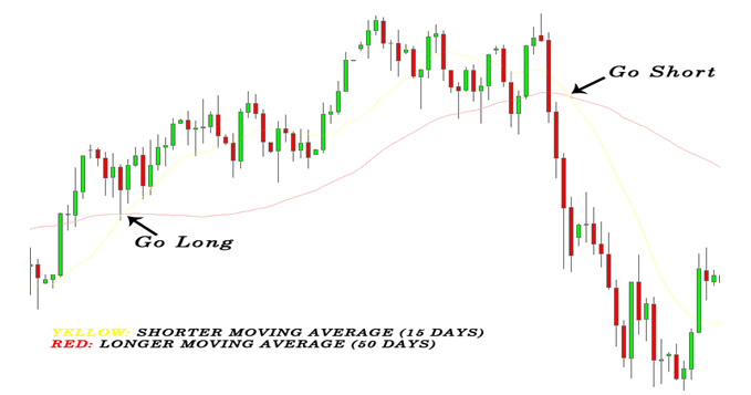
Simple Moving Averages
Simple Moving Averages (SMA) is an indicator frequently used in technical analysis showing the average value of a security's price over a set period. Moving averages are generally used to measure momentum and define areas of possible support and resistance. Moving averages are used to emphasize the direction of a trend and to smooth out price and volume fluctuations, or "noise", that can confuse interpretation. Typically, upward momentum is confirmed, when a short-term average (e.g.15-day) crosses above a longer-term average (e.g. 50-day). Downward momentum is confirmed, when a short-term average crosses below a long-term average.
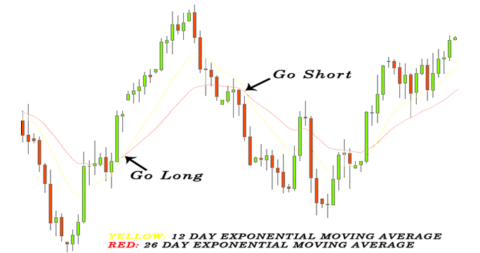
Exponential Moving Averages
Exponential Moving Average (EMA) is a type of moving average that is similar to a simple moving average, except that more weight is given to the latest data. The exponential moving average is also known as "exponentially weighted moving average". This type of moving average reacts faster to recent price changes than a simple moving average. The 12- and 26-day EMAs are the most popular short-term averages, and they are used to create indicators like the moving average convergence divergence (MACD) and the percentage price oscillator (PPO). In general, the 50- and 200-day EMAs are used as signals of long-term trends.
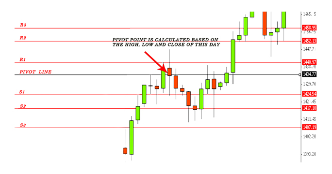
Pivot Points
Pivots Points are significant levels chartists can use to determine directional movement, support and resistance. Pivot Points use the prior period's high, low and close to formulate future support and resistance. In this regard, Pivot Points are predictive or leading indicators. Pivot Points were originally used by floor traders to set key levels. Floor traders are the original day traders. They deal in a very fast moving environment with a short-term focus. At the beginning of the trading day, floor traders would look at the previous day's high, low and close to calculate a Pivot Point for the current trading day. With this Pivot Point as the base, further calculations were used to set support 1, support 2, resistance 1 and resistance 2. These levels would then be used to assist their trading throughout the day.
Support and resistance levels based on Pivot Points can be used just like traditional support and resistance levels. The key is to watch price action closely when these levels come into play. Should prices decline to support and then firm; traders can look for a successful test and bounce off support. It often helps to look for a bullish chart pattern or indicator signal to confirm an upturn from support. Similarly, should prices advance to resistance and stall, traders can look for a failure at resistance and decline. Again, chartists should look for a bearish chart pattern or indicator signal to confirm a downturn from resistance.
Calculation used for Pivot Points:
- Resistance 3 = H + 2*(P-L)
- Resistance 2 = P + (Res1-Sup1)
- Resistance 1= 2 * P - L
- Pivot Point = ( H + C + L ) / 3
- Support 1 = 2 * P - H
- Support 2 = P - (Res1-Sup1)
- Support 3 = L - 2*(H-P)
Example of Pivot Points using gold prices on 31st March 2011 (Figures in USD)
| Open |
High |
Low |
Close |
| 1435.80 |
1445.05 |
1427.80 |
1431.39 |
| R2 |
R1 |
Pivot |
S1 |
S2 |
| 1452.13 |
1440.97 |
1434.77 |
1424.54 |
1417.10 |
Illustration of Pivot Points:
Relative Strength Index
Developed J. Welles Wilder, the Relative Strength Index (RSI) is a momentum oscillator that measures the speed and change of price movements. RSI oscillates between zero and 100. Traditionally, and according to Wilder, RSI is considered overbought when above 70 and oversold when below 30. Signals can also be generated by looking for divergences, failure swings and centerline crossovers. RSI can also be used to identify the general trend. RSI is an extremely popular momentum indicator that has been featured in a number of articles, interviews and books over the years.
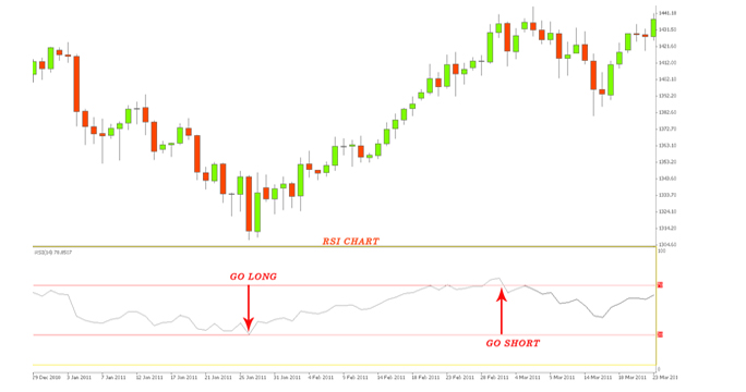
| Levels |
| 30 |
70 |
| Supply>Demand |
Demand>Supply |
| Oversold |
Overbought |
| Under-Valued |
Over-Valued |
| Long Signal |
Short Signal |
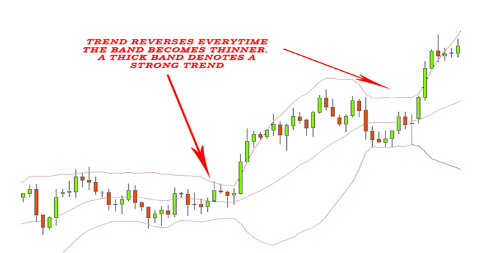
Bollinger Bands
The theory of the Bollinger Bands was propounded//proposed// by John Bollinger in the 1980s. The concept of the Bollinger Bands arose from the need for adaptive trading bands i.e. to determine the overbought and the oversold zones, and the observation that volatility was dynamic, not static. The parameters of the Bollinger Bands are as follows:
- Upper Band: Middle Band + 2(Standard Deviation)
- Middle Band: 20 Days Simple Moving Averages (By Default)
- Lower Band: Middle Band – 2(Standard Deviation)
The three bands indicate the relative definition of the high and low i.e. prices are high at the upper band and low at the lower band. This indicator can assist in pattern recognition and is helpful in comparing prices to the action of the indicators to arrive at a systematic trading decision. As observed from above, there are three bands, which constitute the Bollinger Band. The middle band is a 20 days Simple Moving Average. The upper and the lower band are constructed using the volatile market conditions, which are absorbed by the Standard Deviation of the respective security.
Fibonacci Series
Fibonacci Retracement:
Fibonacci Retracements are ratios used to identify potential reversal levels. These ratios are found in the Fibonacci sequence. The most popular Fibonacci Retracements are 61.8% and 38.2%. Note that 38.2% is often rounded to 38% and 61.8 is rounded to 62%. After an advance, chartists apply Fibonacci ratios to define retracement levels and forecast the extent of a correction or pullback. Fibonacci Retracements can also be applied after a decline to forecast the length of a counter trend bounce. These retracements can be combined with other indicators and price patterns to create an overall strategy. A few basics, however, will provide the necessary background for the most popular numbers. Leonardo Pisano Bogollo (1170-1250), an Italian mathematician from Pisa, is credited with introducing the Fibonacci sequence to the West. It is as follows:
0, 1, 1, 2, 3, 5, 8, 13, 21, 34, 55, 89, 144, 233, 377, 610……
The sequence extends to infinity and contains many unique mathematical properties.
- After 0 and 1, each number is the sum of the two prior numbers (1+2=3, 2+3=5, 5+8=13 8+13=21 etc…).
- A number divided by the previous number approximates 1.618 (21/13=1.6153, 34/21=1.6190, 55/34=1.6176, 89/55=1.6181). The approximation nears 1.6180 as the numbers increase.
- A number divided by the next highest number approximates .6180 (13/21=.6190, 21/34=.6176, 34/55=.6181, 55/89=.6179 etc….). The approximation nears .6180 as the numbers increase. This is the basis for the 61.8% retracement.
- A number divided by another two places higher approximates .3820 (13/34=.382, 21/55=.3818, 34/89=.3820, 55/=144=3819 etc….). The approximation nears .3820 as the numbers increase. This is the basis for the 38.2% retracement. Also, note that 1 - .618 = .382
- A number divided by another three places higher approximates .2360 (13/55=.2363, 21/89=.2359, 34/144=.2361, 55/233=.2361 etc….). The approximation nears .2360 as the numbers increase. This is the basis for the 23.6% retracement.
Here, the mathematical value '1.618' refers to the Golden Ratio or Golden Mean, also called Phi. The inverse of 1.618 is .618. These ratios can be found throughout nature, architecture, art and biology. In his book, Elliott Wave Principle, Robert Prechter quotes William Hoffer from the December 1975 issue of Smithsonian Magazine: ..the proportion of .618034 to 1 is the mathematical basis for the shape of playing cards and the Parthenon, sunflowers and snail shells, Greek vases and the spiral galaxies of outer space. The Greeks based much of their art and architecture upon this proportion. They called it the golden mean. The characteristics of the Fibonacci Retracement are as follows:
- Works best when the market is trending
- Used to determine support and resistance level
- General consensus is the market always reverses from one of the support/resistance levels
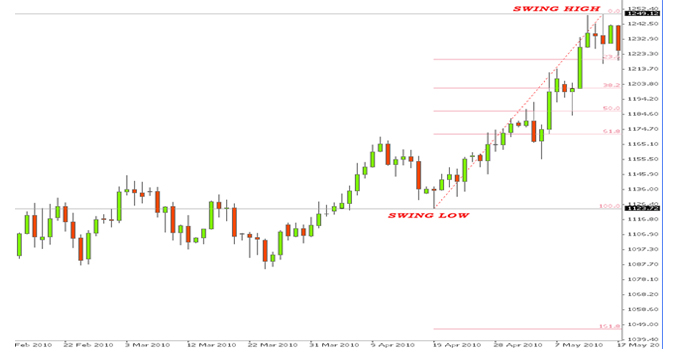
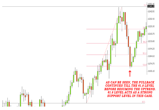
Example of Fibonacci Retracement in an Uptrend Market
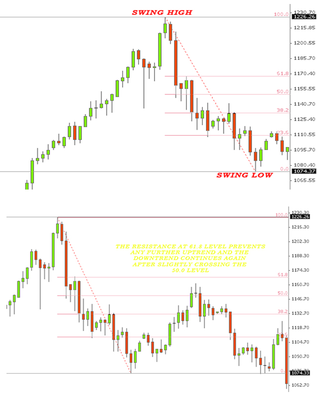
Example of Fibonacci Retracement in a Downtrend Market
Fibonacci with Trend Lines
We have already mentioned in our previous series that Fibonacci works better when the market is trending. In this series, we will be discussing the use of Fibonacci with the trend line. This is an important combination for technical analysis. Trend lines are drawn based on the market trend of the commodity; it can be either uptrend or downtrend.
Now, let's look at the following example and get a clear picture of how to proceed using trend lines with Fibonacci Retracement.
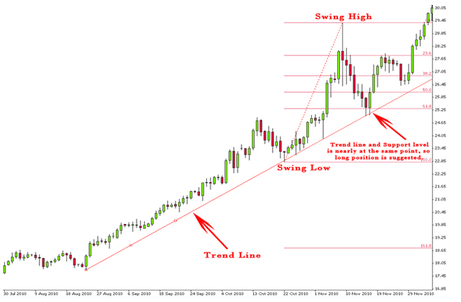
The enhanced industrial demand and the increased investment in the poor man's gold had made silver an investor's delight in the recent memory. As an investor you want to go long in Silver but don't know exactly when. So, you take out the trend line tool and align it, while touching the lowest points. In the above graph, the trend line is drawn from the lowest point of 24th August which touches the lowest levels of 22nd October. You take out the Fibonacci retracement tool and draw the levels taking a swing low price of USD 22.79 (coinciding with one of the lowest levels of 22nd October) and the swing high price of USD 29.34.
The prices of Silver found support at the level of 61.8 which is priced at USD 25.31 on 16th November. You take a long position at this level and wait to see if this analysis is true. On 4th of December the prices of Silver breached the swing high level to fill your bank account.
Fibonacci with Japanese Candlesticks
Fibonacci with Japanese Candlesticks are used to Track the development of exhaustive candlesticks, which suggests the reversal of a trend and indicates a continuation of the real trend.
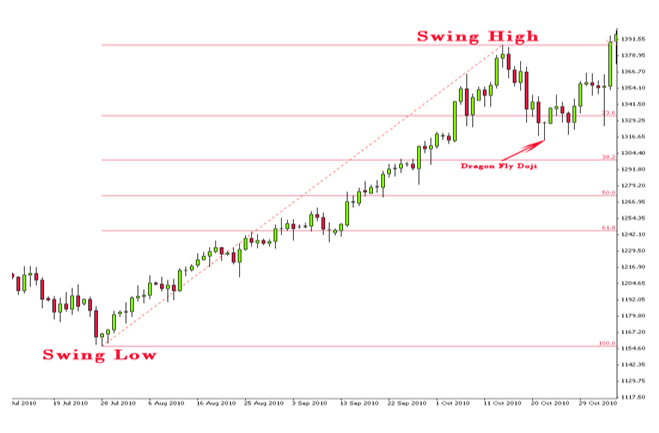
Example of Gold
- Draw the Fibonacci levels taking a swing low price of USD 1156 on 27th July and Swing high price of USD 1387.08 on 14th October
- Gold prices found support at 23.6 Fib Level on 21st October
- Formation of a Dragonfly Doji after a bearish candle the preceding day
- Dragonfly Doji indicates the beginning of a bullish trend
- Take a long position at this level
- Gold Prices break the swing high level on 5th November
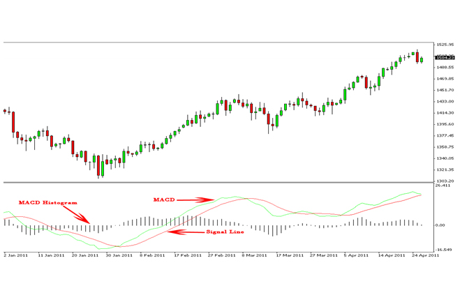
MACD
Developed by Gerald Appel in the late seventies, the MACD turns two moving averages into a momentum oscillator, by subtracting the longer moving average from the shorter moving average. In short, MACD offers the best of both worlds: trend following and momentum. MACD fluctuates above and below the zero line as the moving averages converge, diverge and cross each other.
The calculation used for the MACD is as follows:
- MACD: (12 day EMA – 26 day EMA)
- Signal Line: 9 day EMA of MACD
- MACD Histogram: MACD - Signal Line
The closing prices of the security are used for these moving averages. A 9 day EMA of the MACD is plotted with the indicator to act as a signal line to identify the turns. The MACD Histogram represents the difference between MACD and the signal line. The histogram is positive, when the MACD is above the signal line and negative, when MACD is below its signal line.
Rules for Trading
- When MACD>Signal Line=Bullish Market
- When MACD<Signal Line=Bearish Market
Stochastic
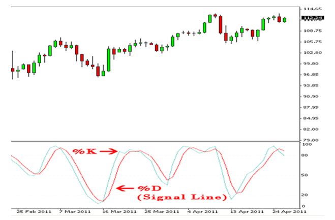
Developed by George C. Lane in the late 1950s, the Stochastic Oscillator is a momentum indicator that shows the location of the close relative to the high-low range over a set number of periods. According to an interview with Lane, the Stochastic Oscillator "doesn't follow price, it doesn't follow volume or anything like that. It follows the speed or the momentum of price. As a rule, the momentum changes direction before price." As such, bullish and bearish divergences in the Stochastic Oscillator can be used to foreshadow reversals. This was the first, and most important, signal that Lane identified. Lane also used this oscillator to identify bull and bear set-ups to anticipate a future reversal. Because the Stochastic Oscillator is range bound, it is also useful for identifying overbought and oversold levels.
Stochastic Oscillator is a technical momentum indicator that compares a security's closing price to its price range over a given time period. The oscillator's sensitivity to market movements can be reduced by adjusting the time period or by taking a moving average of the result. This indicator is calculated with the following formula:
Stochastic Calculation
%K = (Current Close - Lowest Low)/(Highest High - Lowest Low) * 100
%D = 3-day SMA of %K
Types of Stochastic:
- Fast Stochastic Oscillator
Fast %K=%K basic calculator
Fast %D=3-period SMA of Fast %K
- Slow Stochastic Oscillator
Slow %K=Fast %K smoothed with 3-period SMA
Slow %D=3-period SMA of Slow %K
- Full Stochastic Oscillator
Full %K=Fast %K smoothed with X-period SMA
Full %D=X-period SMA of Full %K
Parabolic SAR
Parabolic SAR was developed by Welles Wilder. The Parabolic SAR refers to a price and time based pricing trading system which Wilder had called it the Parabolic Time/Price System. The acronym for SAR is Stop and Reversal, which is the actual indicator used in this system. The theory behind this concept is that SAR trails price as the trend extends over time. The indicator is below, when the prices are rising and it lies above, when prices are falling. The simple concept is that the indicator stops and reverses, when the price trend reverses and then breaks above or below the indicator.
The calculation of SAR is extremely complex and it is difficult to put in a spreadsheet. SAR follows the prices and can be considered as a trend following indicator. Once a downtrend reverses and starts up, SAR follows price like a trailing stop. The stop continues to rise as long as the uptrend remains in place. In other words, SAR never decreases in an uptrend and continuously protects profits as price advances. The indicator acts as a guard against the propensity to lower a stop-loss. Once price stops rising and reverses below SAR, a downtrend starts and SAR is above the price. SAR follows prices lower like a trailing stop. The stop continuously falls as long as the downtrend extends. Since SAR never rises during a downtrend, it continuously protects profits on short positions.
The following is an illustration of SAR on a daily silver chart
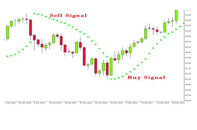
The Parabolic SAR is best suited with trending commodities, which occurs roughly 30% of the time according to Wilder's estimates. SAR is designed to catch the trend and follow it like a trailing stop. As with most other indicators, the signal accuracy depends on the settings and the characteristics of the commodity. The right settings combined with decent trends can produce a great trading system. There is no golden rule in the settings with each commodity being evaluated on its own set of characteristics. Parabolic SAR can also be used in combination with the other indicators for better forecasting results.
Weaknesses of Technical Analysis
Analyst Bias: Just as with fundamental analysis, technical analysis is subjective and our personal biases can be reflected in the analysis. It is important to be aware of these biases, when analyzing a chart. If the analyst is a perpetual bull, then a bullish bias will overshadow the analysis. On the other hand, if the analyst is a disgruntled eternal bear, then the analysis will probably have a bearish tilt.
Open to Interpretation: Furthering the bias argument is the fact that technical analysis is open to interpretation. Even though there are standards, many times two technicians will look at the same chart and paint two different scenarios or see different patterns. Both will be able to come up with logical support and resistance levels as well as key breaks to justify their position. While this can be frustrating, it should be pointed out that technical analysis is more like an art, than a science, somewhat like economics. Whether, the cup half-empty or half-full is in the eye of the beholder.
Too Late: Technical analysis has been criticized for being too late. By the time the trend is identified, a substantial portion of the move has already taken place. After such a large move, the reward to risk ratio is not great. Lateness is a particular criticism of Dow Theory.
Always another Level: Even after a new trend has been identified, there is always another "important" level close at hand. Technicians have been accused of sitting on the fence and never taking an unqualified stance. Even if they are bullish, there is always some indicator or some level that will qualify their opinion.
|